Mandatory Options
Where I’m working at the moment we’re using a tool called Splunk for some log file viewing and analysis. I hadn’t come across it, though apparently it’s quite well known.
So wanting to know a bit more about it, I thought I’d have a run through of their tutorial. To do that you have to sign up for an account. That’s fine, it’s free, there’s no obligation. I’ve signed up for plenty of things.
Except… well, look:
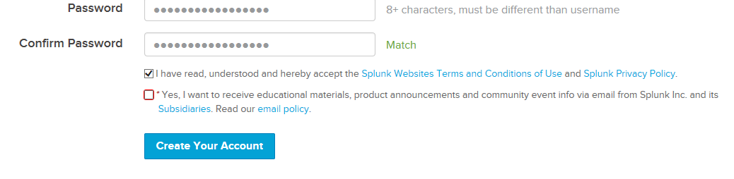
That little “Yes, I want to receive…” checkbox looks like a fairly standard opt-in. The kind we always opt out of. But look at it. Look at its reddish border. The asterisk. These are fairly standard1 ways of indicating that a field is mandatory.
A mandatory opt-in checkbox.
A mandatory option.
After grabbing that screenshot I closed the page. How not to get people to sign up.
-
Though the red is bad UI/UX, because it doesn’t work well for people with colour-blindness. ↩︎